Best Practices for Game UI/UX Design
Design a HUD, feedback, input reach, and pause screen for a small game in any engine, so players understand what is happening without reading a paragraph.
Good game UI is mostly invisible. Players glance, understand, and go back to playing. Bad UI makes them stop and read, or worse, miss something important.
You do not need a UI artist to get the basics right. You need a few rules and the discipline to test them. This guide works in any engine. It covers one HUD, feedback when actions work, input reach for touch and mouse, and a pause screen that respects what the player was doing.
Start with what the player must know
Before you draw anything, list what the player needs to know during play. Be strict. For a small action game, the list might be:
- How much health is left.
- Whether the special ability is ready.
- Where the goal is.
That is often enough. Score, timers, and inventory counts can live on a pause or results screen unless the game is about them.
For each item, ask: does the player need this every second, or only sometimes? Every-second items belong on the HUD. Sometimes items can appear only when they change, then fade.
Show health as a shape
Players read shapes and colors faster than numbers or words. A bar that shrinks, a row of hearts, or a ring that empties all work at a glance.
A few practical rules:
- Make loss visible. When health drops, show the lost portion briefly in a contrasting color before it disappears. The player sees how much the hit cost.
- Do not rely on color alone. Some players cannot tell certain colors apart. Pair color with shape or size, like a bar that also pulses or a heart that cracks.
- Warn at low health. A gentle pulse or a change in the edge of the screen tells players to be careful without making them look away from the action.
Keep the HUD near the edges, but not jammed into corners where it gets lost. Leave the center for the game.
Consider putting the cue in the world
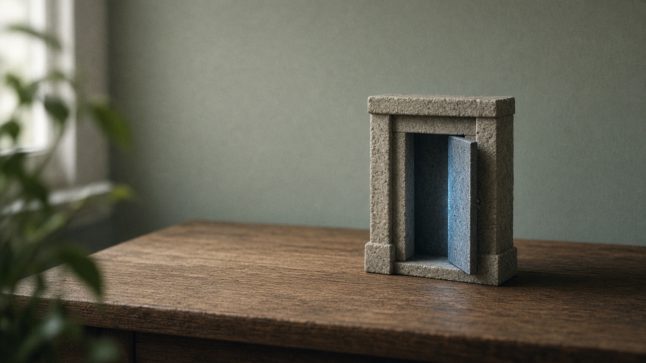
Sometimes the best HUD element is not on the HUD at all. A diegetic cue lives inside the game world.
Examples:
- A door that glows when it can be opened.
- A shield on the character’s arm that cracks as it weakens.
- A weapon that sparks when the special attack is charged.
World cues keep the player’s eyes on the action. They also make your game feel more solid. The trade-off is clarity: a cue in the world can be hidden by the camera angle or lost in a busy scene. Test it in your worst-case scene, not your prettiest one.
Give every action a response
When a player presses a button, the game should answer within a moment. If nothing happens, they press again, or assume the game is broken.
Good feedback stacks a few small signals:
- Visual: the sprite flashes, the button squashes, a small burst appears.
- Audio: a short, distinct sound for each kind of action.
- Motion: a tiny camera shake for impacts, a brief pause on a strong hit.
You do not need all three every time. A menu click might need only a sound and a highlight. A heavy hit might use all three.
Feedback also matters when an action fails. If the player tries to open a locked door, play a dull thud and shake the handle. That tells them the input worked, but the door did not. Silence on a failed action feels like a bug.
Keep feedback proportional. If picking up a coin looks as dramatic as defeating a boss, both lose meaning.
Design for reach, not just looks
Where you place controls depends on how the player holds the device.
Mouse and keyboard. The mouse can reach any part of the screen, but long trips slow the player down. Put frequently used buttons close together. Give clickable items a generous hit area, larger than the visible icon if needed. Show a hover state so players know what is clickable.
Touch. Thumbs do the work, and they cover part of the screen while they do it. Most players hold a phone near the bottom corners, so place main actions within easy thumb reach. Keep the top of the screen for information rather than buttons.
A few touch rules worth following:
- Make touch targets large and spaced apart so a thumb does not hit two at once.
- Do not hide important information under where thumbs rest.
- Confirm destructive actions, like quitting or selling an item, since a stray tap is easy.
Controller. Players cannot point, so menus need a clear selected state and a predictable order when moving between items.
If your game ships on more than one input type, test each one separately. A layout that feels right with a mouse can feel cramped on a phone.
Make the pause screen respect the moment
A pause screen often covers the whole game with a dark panel and a menu. That works, but it hides what the player was doing. When they unpause, they have to rebuild their sense of the scene in a split second.
Better habits:
- Dim, do not hide. Darken or blur the game slightly and keep it visible behind the menu.
- Keep the menu to one side so the player character and nearby threats stay in view.
- Resume with a short countdown or a brief slow start in fast games, so the player is not hit the instant they unpause.
- Pause when the window loses focus or the phone receives a call, so the player never returns to a lost run.
Put the most common choice, Resume, first and selected by default. Put Quit at the end and ask for confirmation.
Test with real players
You know where every element is, so you cannot judge your own UI fairly. Watch someone else play.
During a short session, note:
- Where their eyes go when something important happens.
- Any moment they ask what something means.
- Any action they repeat because they were not sure it worked.
- Any time they miss a warning, like low health.
Do not explain the UI before they start. If you have to explain it, the UI needs work.
After the session, fix the single biggest problem first, then test again. One fix at a time shows you what helped.
A short checklist
Before you call your UI done, run through this:
- Can a new player understand health and the main goal without reading?
- Does every input give some response, including failed ones?
- Are touch targets easy to reach and hard to miss?
- Does the HUD leave the center of the screen clear?
- Can players still see the game while paused?
- Does anything rely only on color?
Fix what fails, and keep the list for your next project. Good UI is a set of habits more than a single design, and those habits carry from game to game.